Low Fidelity Wireframes
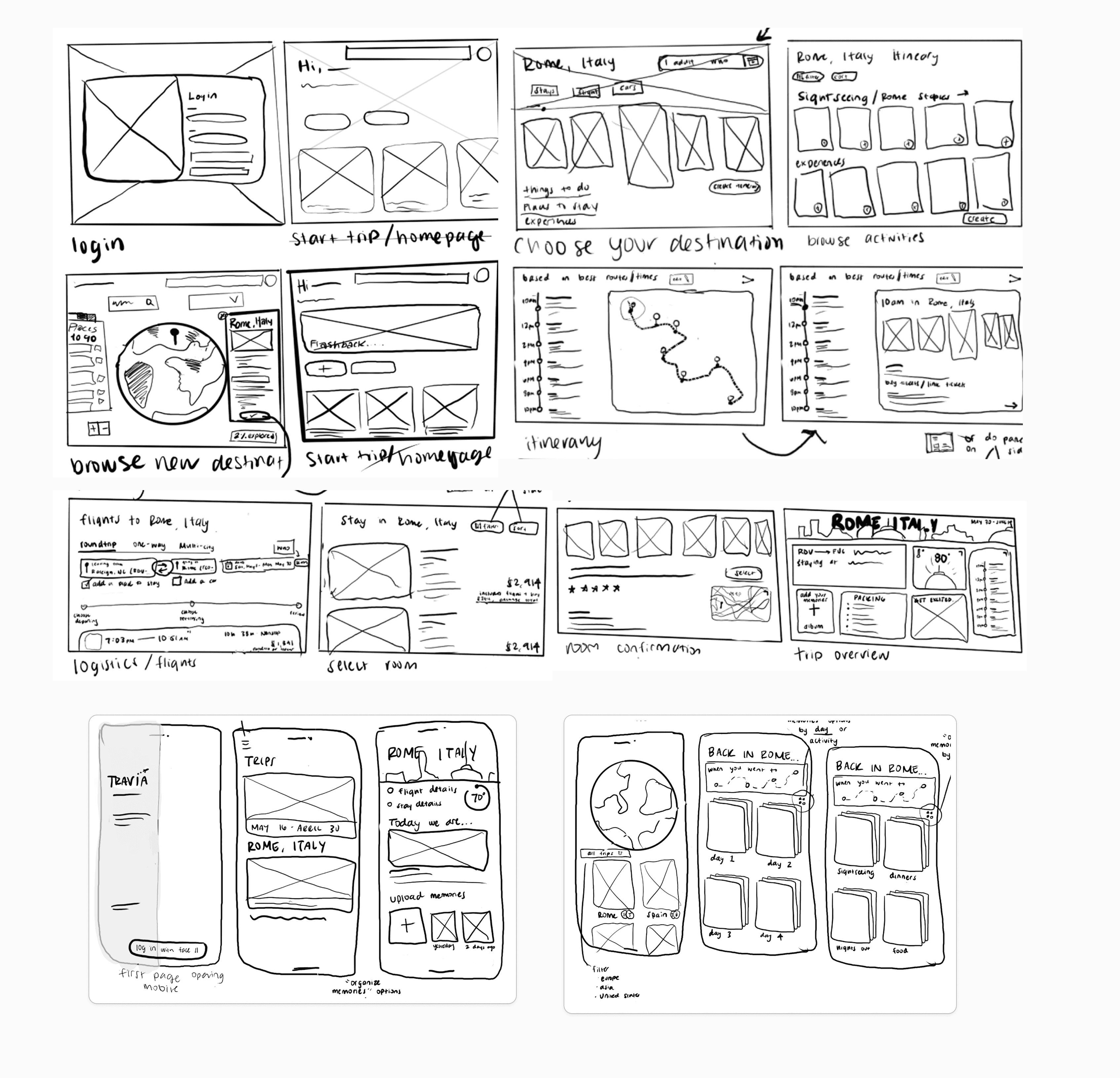
To translate our user flows into a tangible structure, we began with rapid, hand-drawn low-fidelity wireframes. This phase was critical for visualizing the cross-platform handoff, ensuring that the heavy logistics of planning felt natural on a desktop, while the spontaneous act of memory logging was perfectly optimized for mobile. We worked together to design how we wanted each screen to look. This step was crucial as we would enter these screens into the AI that would create our final design.
Style Tile
To establish a consistent, immersive visual identity and feed structural style guidelines into our generation pipeline, we created a comprehensive mood board and UI component framework. We wanted Travia to have a frosted glassmorphism and cool slate-and-white look.
Vibe Coding
Finally, we arrived at the vibe coding step. We collected all of our research, wireframes, and style tile and input this along with very detailed instructions of what we wanted to be created. We utilized Figma Make, Loveable, and Replit to test many different platforms and see what we liked best.
Figma Make: Allowed us to make multiple iterations during the vibe coding process.
Loveable: Easy to operate and develop complex ideas with.
Replit: Helped create our vision of immersive UI come to life.
Finally, we arrived at the vibe coding step. We collected all of our research, wireframes, and style tile and input this along with very detailed instructions of what we wanted to be created. We utilized Figma Make, Loveable, and Replit to test many different platforms and see what we liked best.
Figma Make: Allowed us to make multiple iterations during the vibe coding process.
Loveable: Easy to operate and develop complex ideas with.
Replit: Helped create our vision of immersive UI come to life.
User Testing
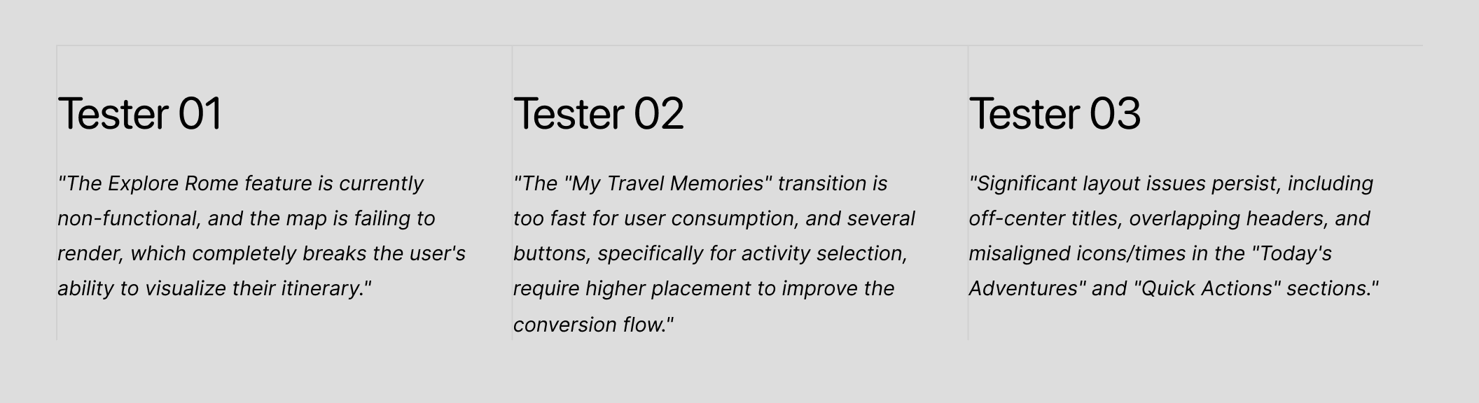
After going through a few rounds of vibe coding, we decided to settle on using Figma Make as our main platform. Once we felt that the design was where we wanted it, we conducted three rounds of user testing and tasked each user with planning a trip to Rome, Italy. This task revealed how easily they navigated the transition from desktop planning to mobile execution, highlighting key friction points in the flow.
Final Designs
The final high-fidelity prototype of Travia establishes a seamless omnichannel ecosystem, directly addressing the core user need to bridge high-friction logistical planning with intuitive, in-situ memory capture. Designed to support complex cognitive tasks, the desktop interface serves as a centralized dashboard where users can engage in exploratory discovery via an interactive 3D globe. From there, the platform guides users through a streamlined booking funnel that integrates activity curation, accommodation selection, and flight logistics into a single cohesive flow, effectively reducing cognitive load and context-switching during the trip-building phase.
To support the user's changing environment, the ecosystem hands off to a mobile companion app optimized for on-the-go usability. Recognizing this shift in user context, the mobile UI utilizes progressive disclosure to immediately surface real-time itinerary data while stripping away heavy planning mechanics. Leveraging behavioral nudges via proactive notifications, the app encourages spontaneous engagement. Paired with a frictionless memory-logging feature, users can seamlessly document localized experiences with contextual metadata, ultimately resolving the pain point of passive archiving identified in our initial generative research.
The final high-fidelity prototype of Travia establishes a seamless omnichannel ecosystem, directly addressing the core user need to bridge high-friction logistical planning with intuitive, in-situ memory capture. Designed to support complex cognitive tasks, the desktop interface serves as a centralized dashboard where users can engage in exploratory discovery via an interactive 3D globe. From there, the platform guides users through a streamlined booking funnel that integrates activity curation, accommodation selection, and flight logistics into a single cohesive flow, effectively reducing cognitive load and context-switching during the trip-building phase.
To support the user's changing environment, the ecosystem hands off to a mobile companion app optimized for on-the-go usability. Recognizing this shift in user context, the mobile UI utilizes progressive disclosure to immediately surface real-time itinerary data while stripping away heavy planning mechanics. Leveraging behavioral nudges via proactive notifications, the app encourages spontaneous engagement. Paired with a frictionless memory-logging feature, users can seamlessly document localized experiences with contextual metadata, ultimately resolving the pain point of passive archiving identified in our initial generative research.
Vibe Coding
Finally, we arrived at the vibe coding step. We collected all of our research, wireframes, and style tile and input this along with very detailed instructions of what we wanted to be created. We utilized Figma Make, Loveable, and Replit to test many different platforms and see what we liked best.
Figma Make: Allowed us to make multiple iterations during the vibe coding process.
Loveable: Easy to operate and develop complex ideas with.
Replit: Helped create our vision of immersive UI come to life.
Style Tile
User Testing
After going through a few rounds of vibe coding, we decided to settle on using Figma Make as our main platform. Once we felt that the design was where we wanted it, we conducted three rounds of user testing and tasked each user with planning a trip to Rome, Italy. This task revealed how easily they navigated the transition from desktop planning to mobile execution, highlighting key friction points in the flow.
Final Design
The final high-fidelity prototype of Travia establishes a seamless omnichannel ecosystem, directly addressing the core user need to bridge high-friction logistical planning with intuitive, in-situ memory capture. Designed to support complex cognitive tasks, the desktop interface serves as a centralized dashboard where users can engage in exploratory discovery via an interactive 3D globe. From there, the platform guides users through a streamlined booking funnel that integrates activity curation, accommodation selection, and flight logistics into a single cohesive flow, effectively reducing cognitive load and context-switching during the trip-building phase.
To support the user's changing environment, the ecosystem hands off to a mobile companion app optimized for on-the-go usability. Recognizing this shift in user context, the mobile UI utilizes progressive disclosure to immediately surface real-time itinerary data while stripping away heavy planning mechanics. Leveraging behavioral nudges via proactive notifications, the app encourages spontaneous engagement. Paired with a frictionless memory-logging feature, users can seamlessly document localized experiences with contextual metadata, ultimately resolving the pain point of passive archiving identified in our initial generative research.
To establish a consistent, immersive visual identity and feed structural style guidelines into our generation pipeline, we created a comprehensive mood board and UI component framework. We wanted Travia to have a frosted glassmorphism and cool slate-and-white look.