USCF

2025

USCF: Website Redesign

A comprehensive UX audit and information architecture redesign to streamline navigation and modernize the digital platform for the US Chess Federation.

Role

Product Design Intern

Timeline

Jun 2025 - Oct 2025

Team

Esha Macha, Natasha Roberts, & Sangeeta Parakala

Platform

Website

Role

Product Design Intern

Timeline

Jun 2025 - Oct 2025

Team

Esha Macha, Natasha Roberts, & Sangeeta Parakala

Platform

Website

Overview

The US Chess Federation (USCF) serves as the national governing body for chess in the United States. As a Product Design Intern, I led a comprehensive UX audit and redesign of their digital platform to resolve critical information architecture challenges. By applying rigorous user research methods, I restructured the primary navigation and modernized the landing page to transform a fragmented interface into a cohesive, accessible, and user-friendly experience for the chess community.

Problem

Summary

The digital experience for the US Chess Federation was fragmented and visually outdated. The challenge was to simplify the complex information architecture and redesign the landing page to reduce cognitive load, improve global navigation usability, and help the chess community access critical resources more efficiently.

My Role

As the Product Design Intern, I conducted a comprehensive UX audit, analyzed existing navigation models alongside user pain points, and translated those insights into a restructured information architecture and modernized interface concepts to elevate the digital experience.

Existing Issues

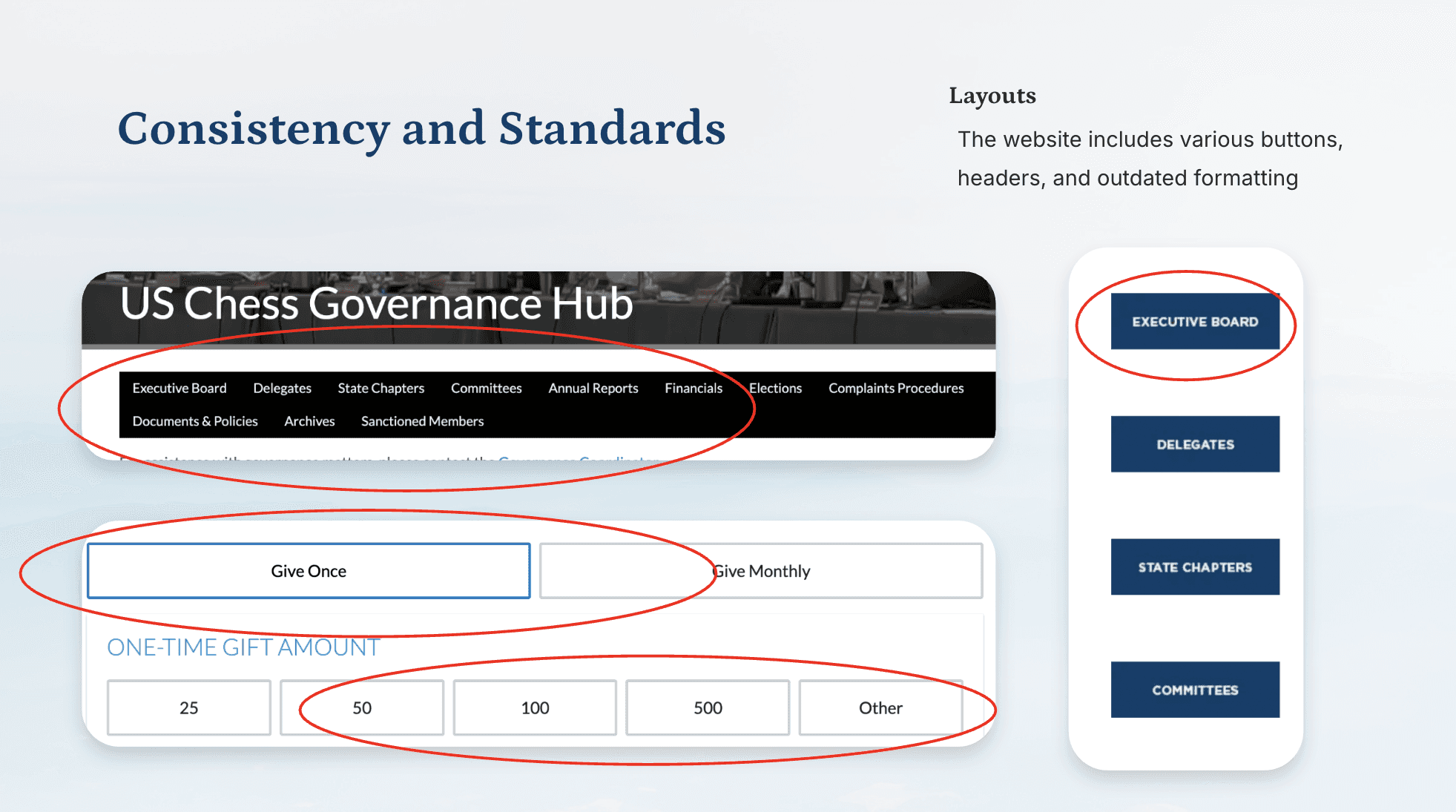
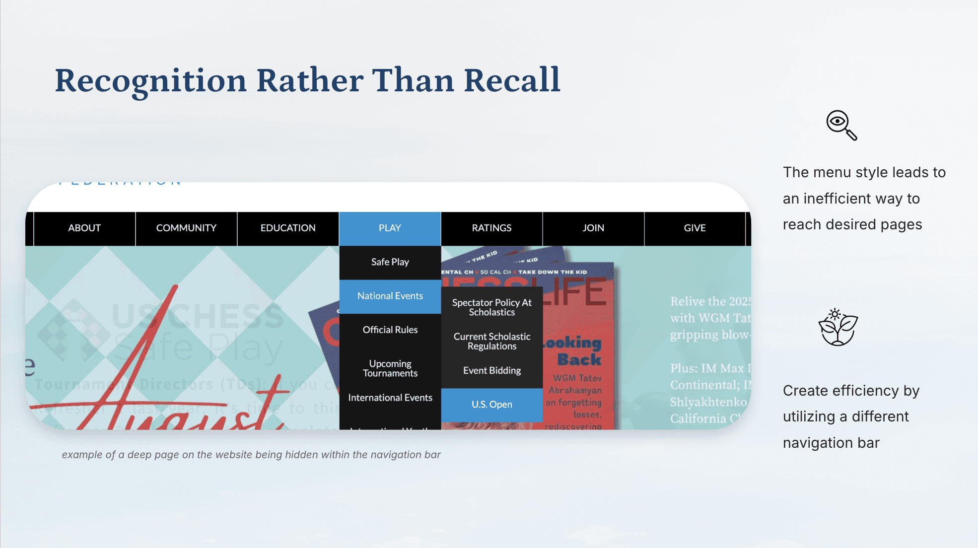
The legacy website was overwhelmed by dense and text-heavy layouts with a severe lack of proper visual hierarchy. Users were forced to navigate a deep and overly complex dropdown menu structure, making it exceedingly difficult to locate specific pages. Competing calls to action and inconsistent visual formatting across pages left the interface feeling cluttered and uninviting.

Data-Driven Insights

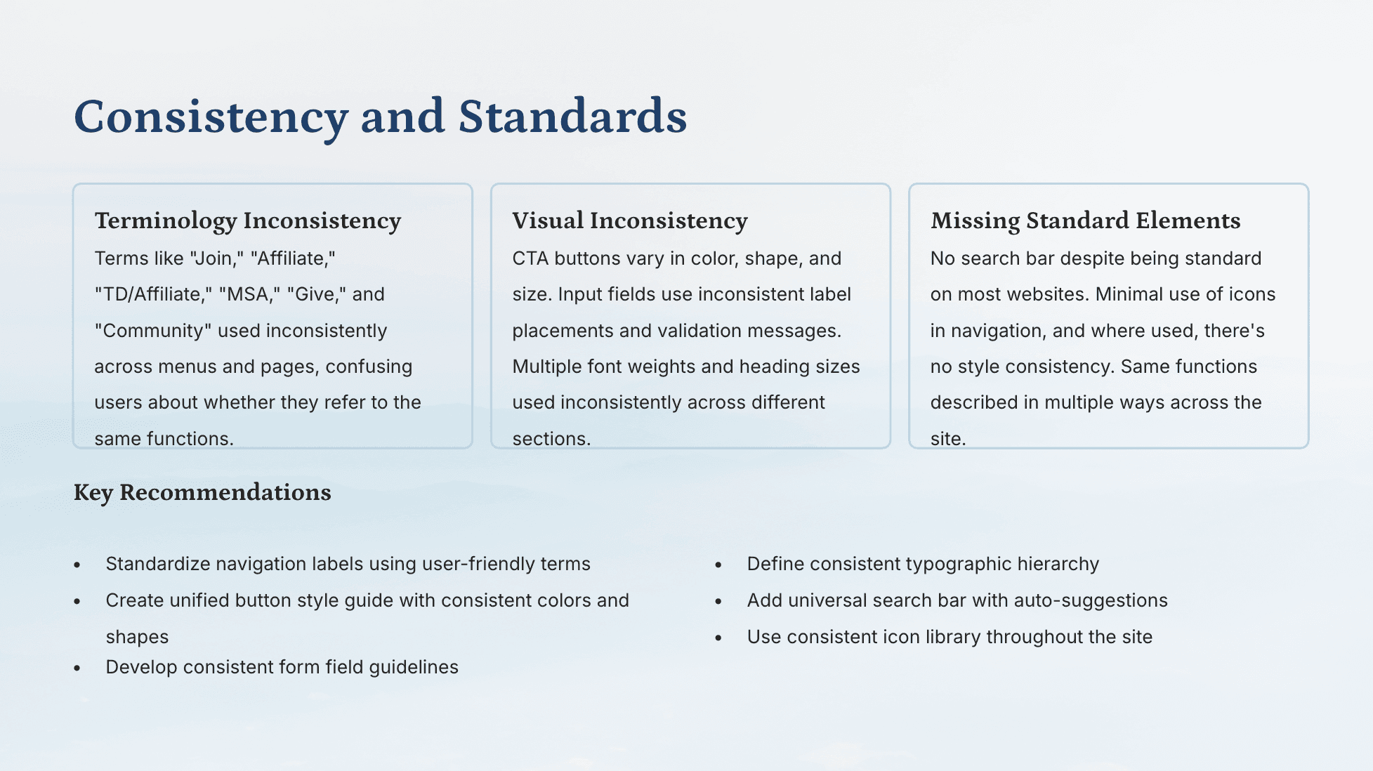
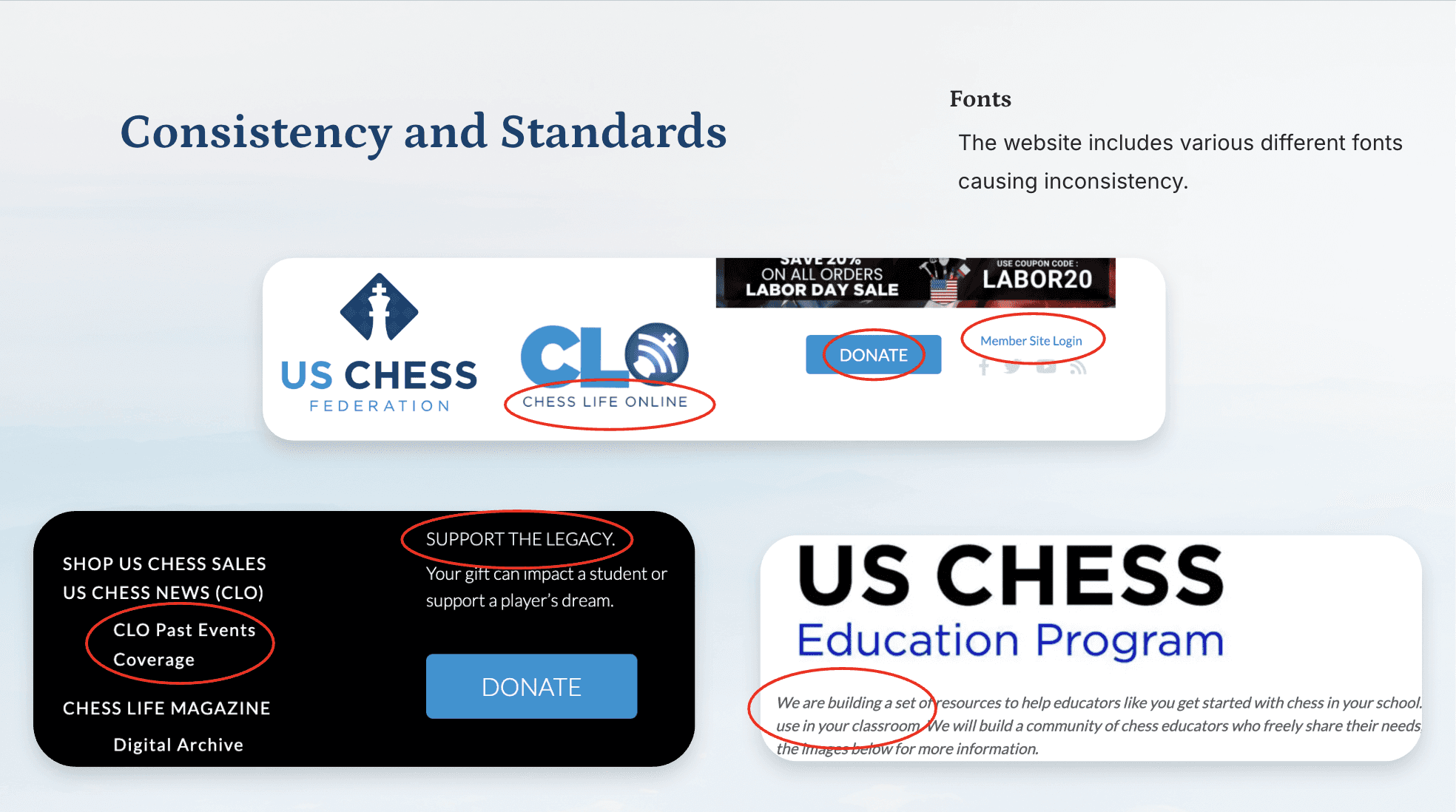
The initial UX audit revealed critical usability barriers across the architecture of the platform. The sheer volume of pages buried deep within the navigation created massive friction for users trying to complete primary tasks. Furthermore, the audit highlighted a highly inconsistent visual language, including erratic font styles, button shapes, and colors that degraded overall accessibility.

Research
Heuristic Evaluation

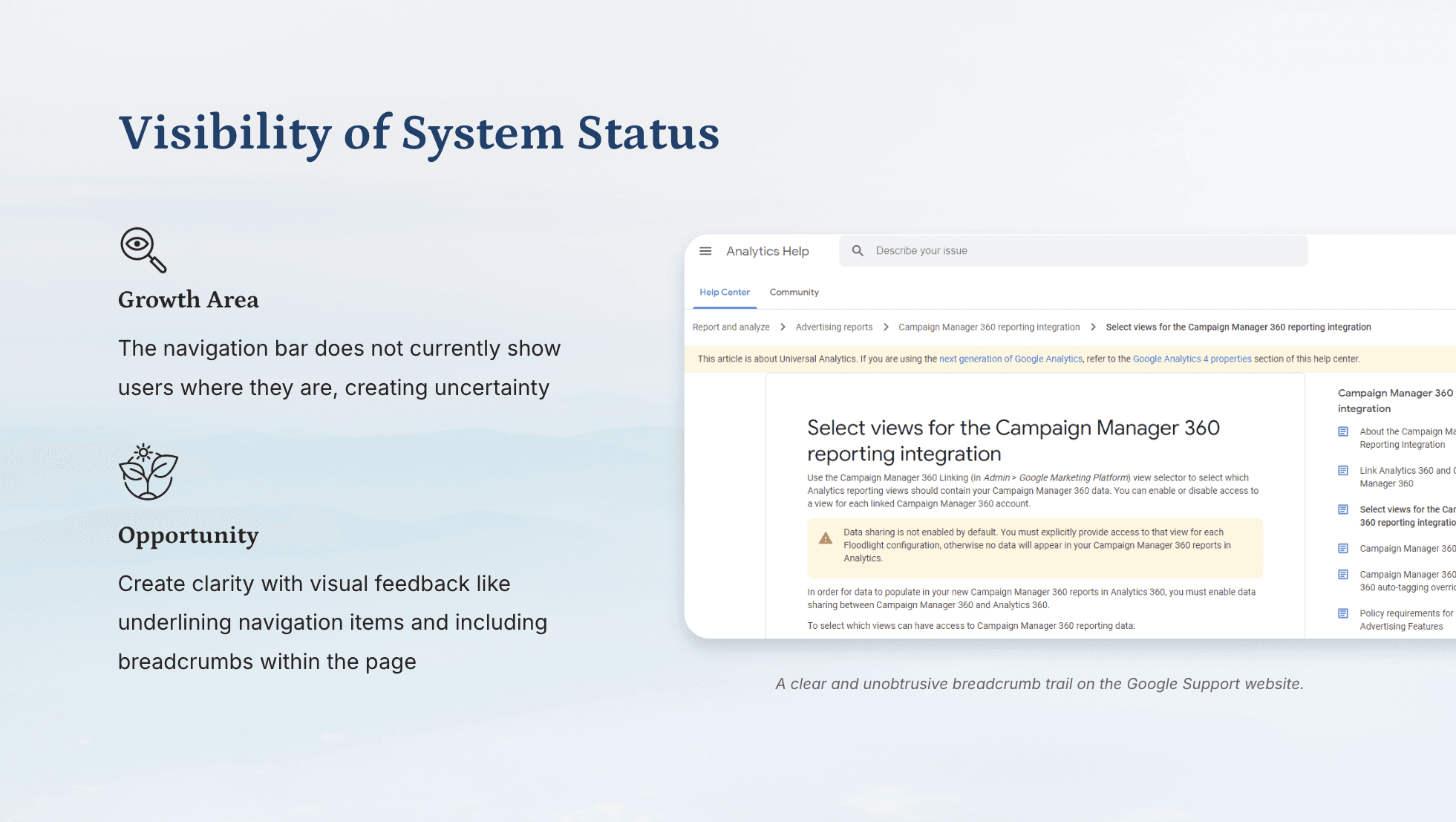
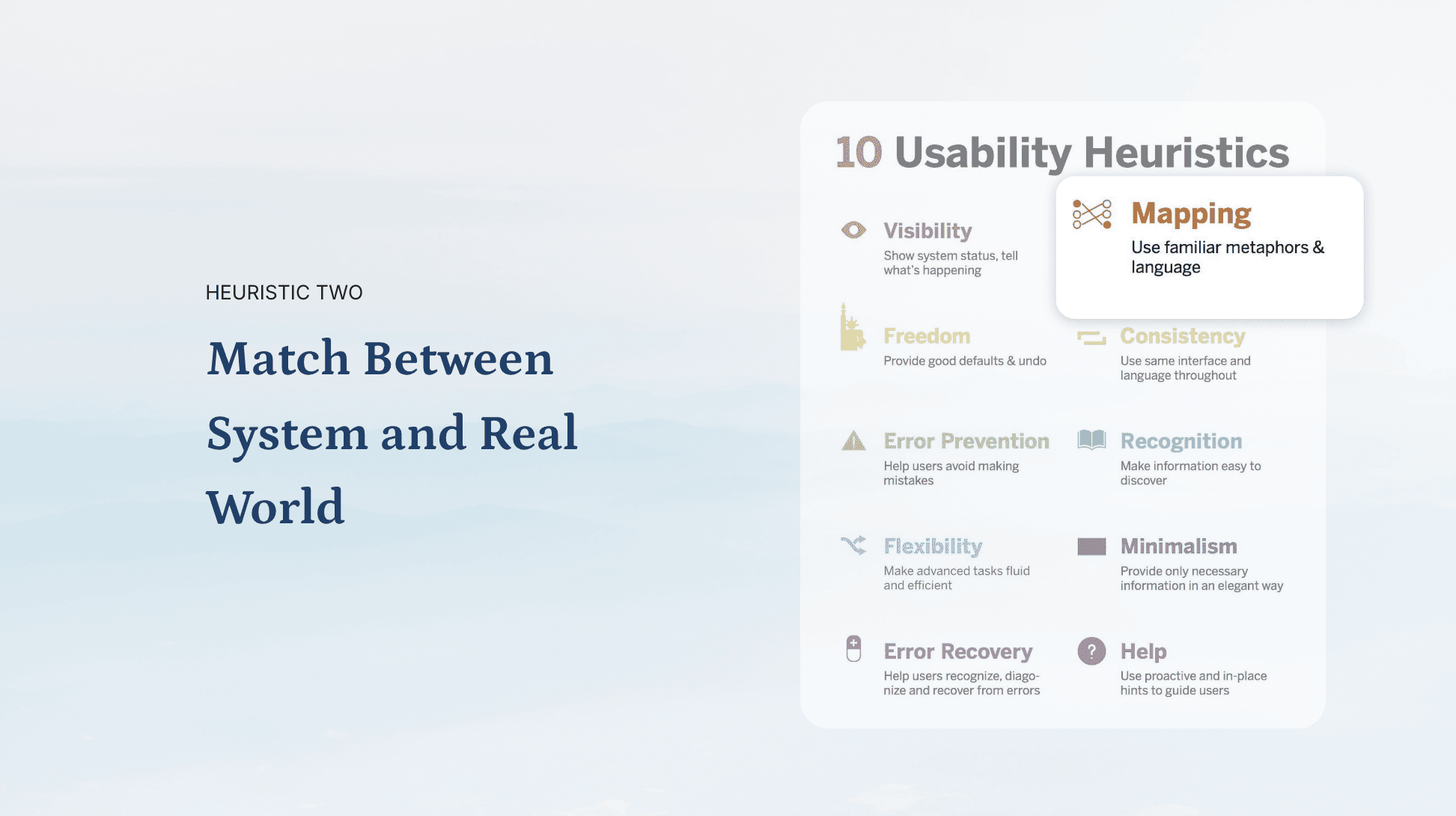
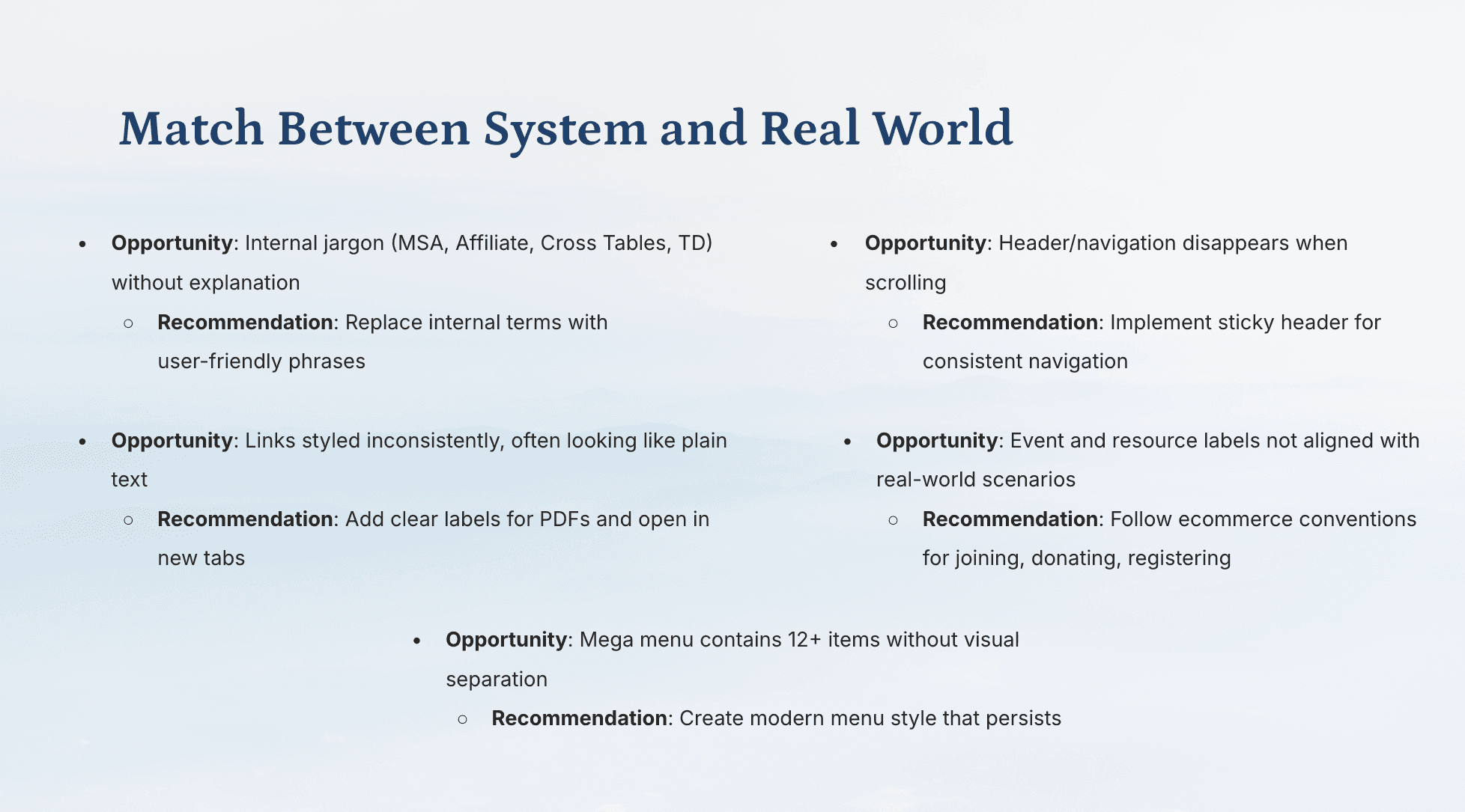
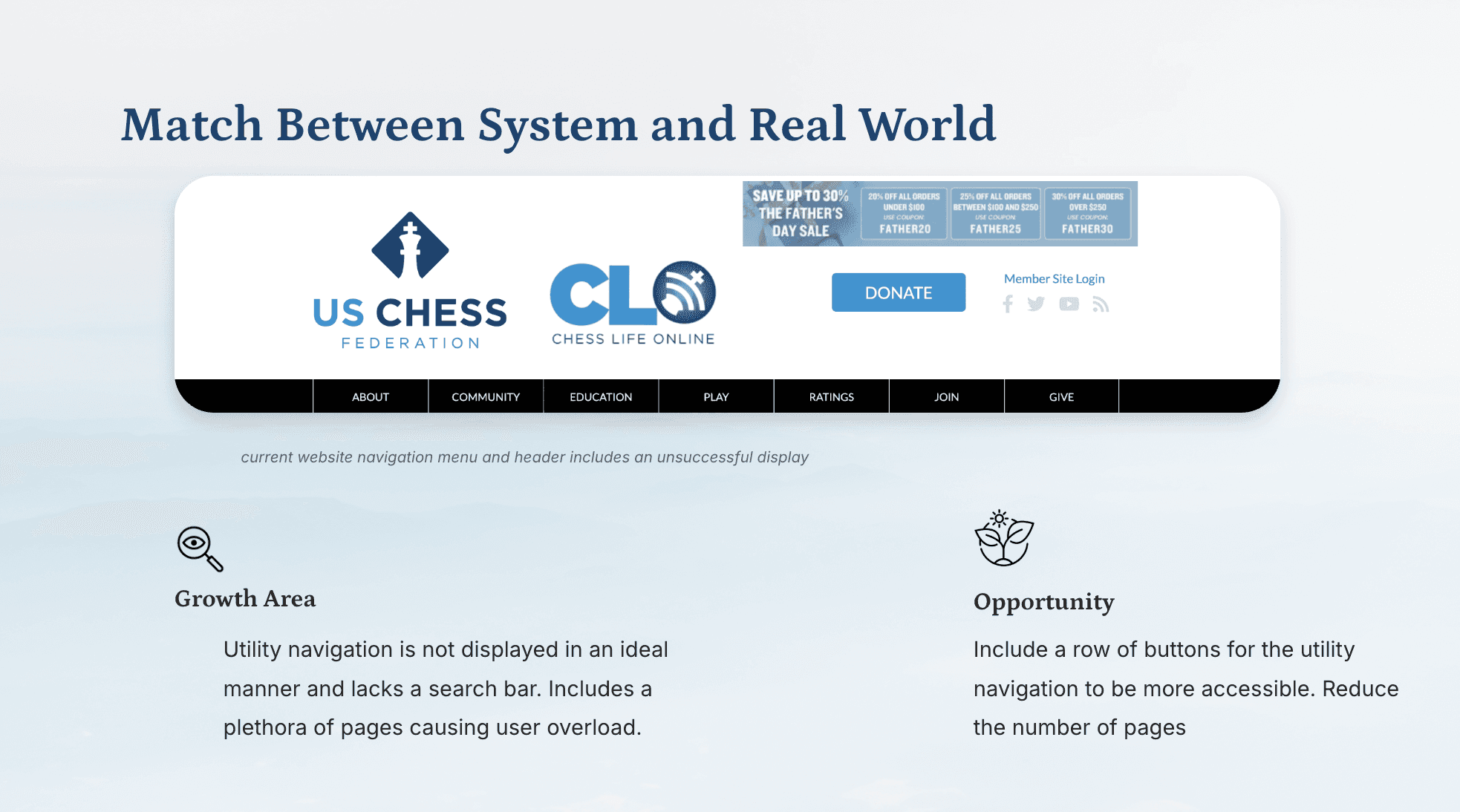
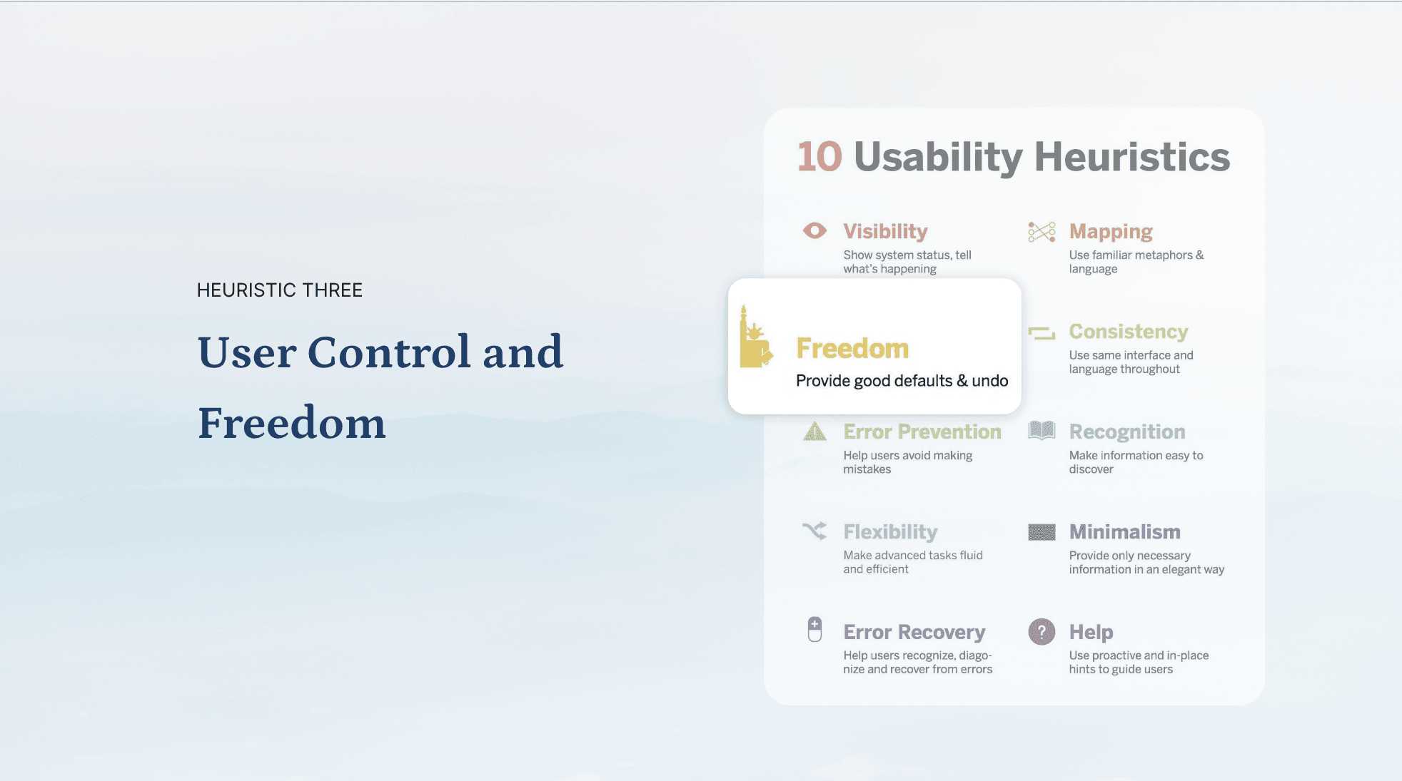
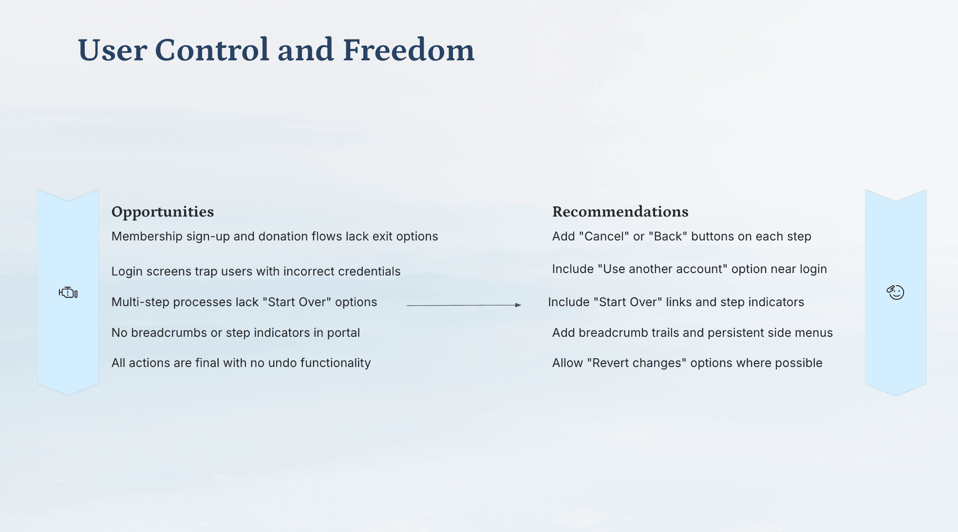
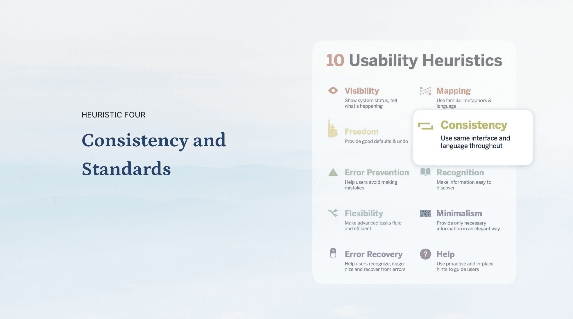
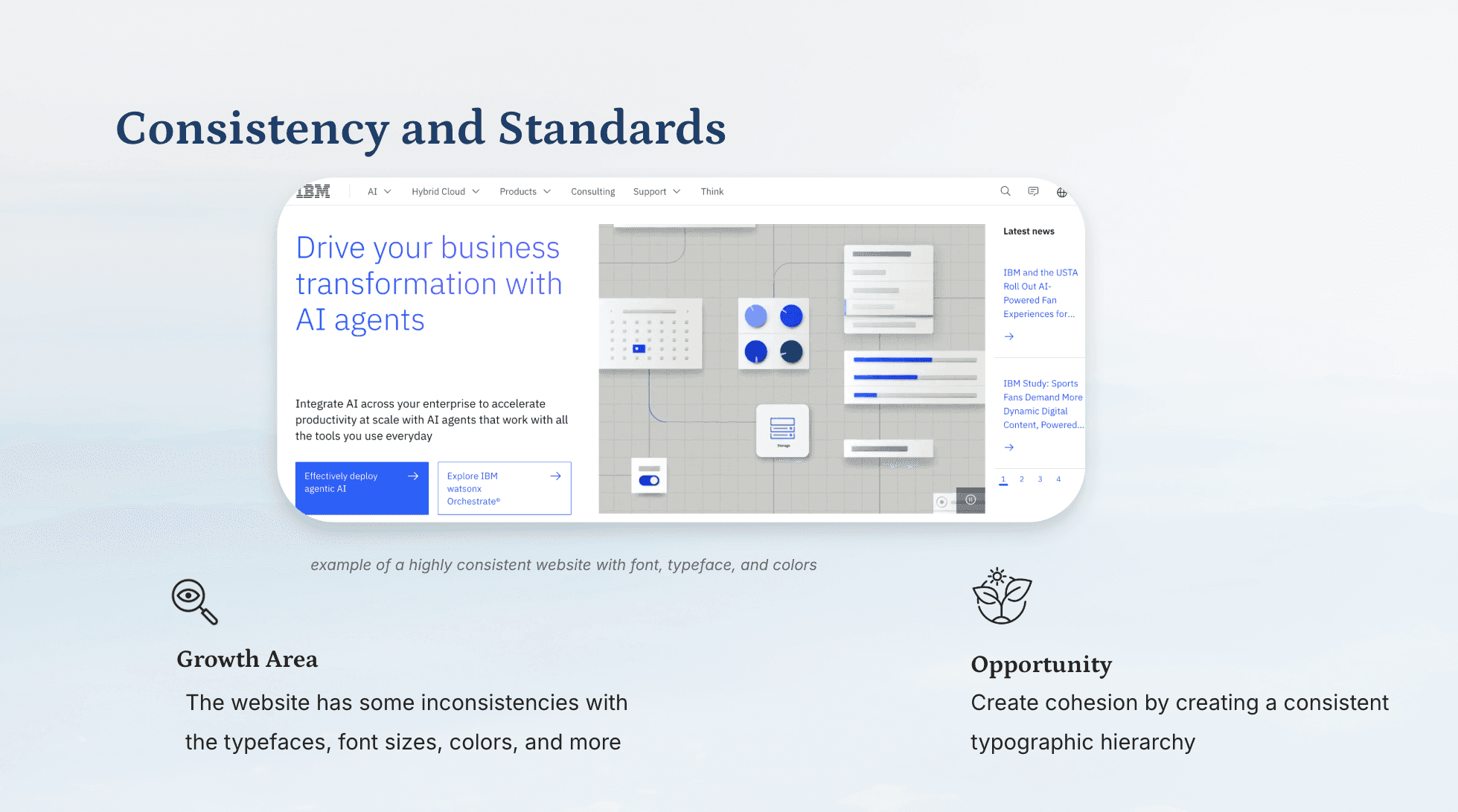
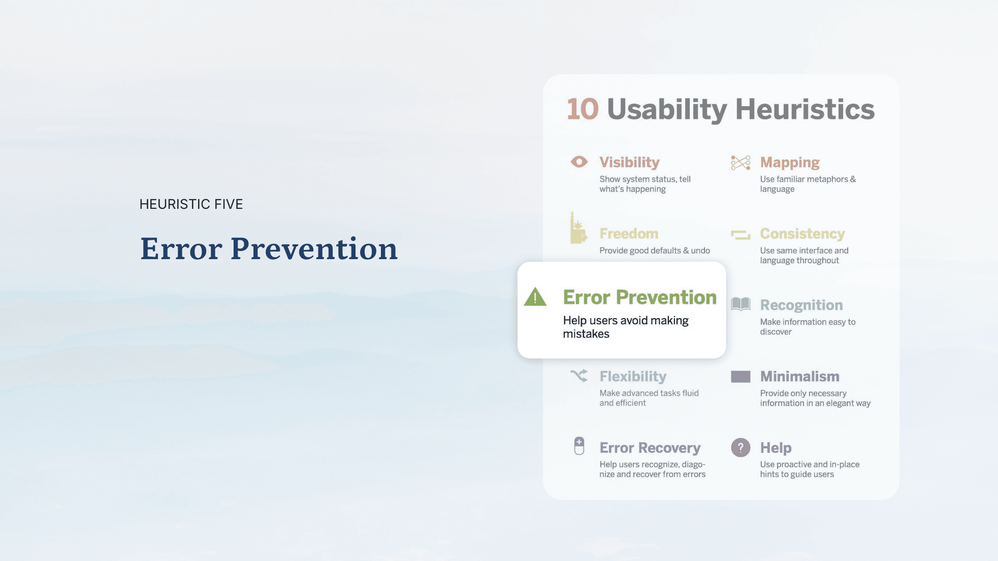
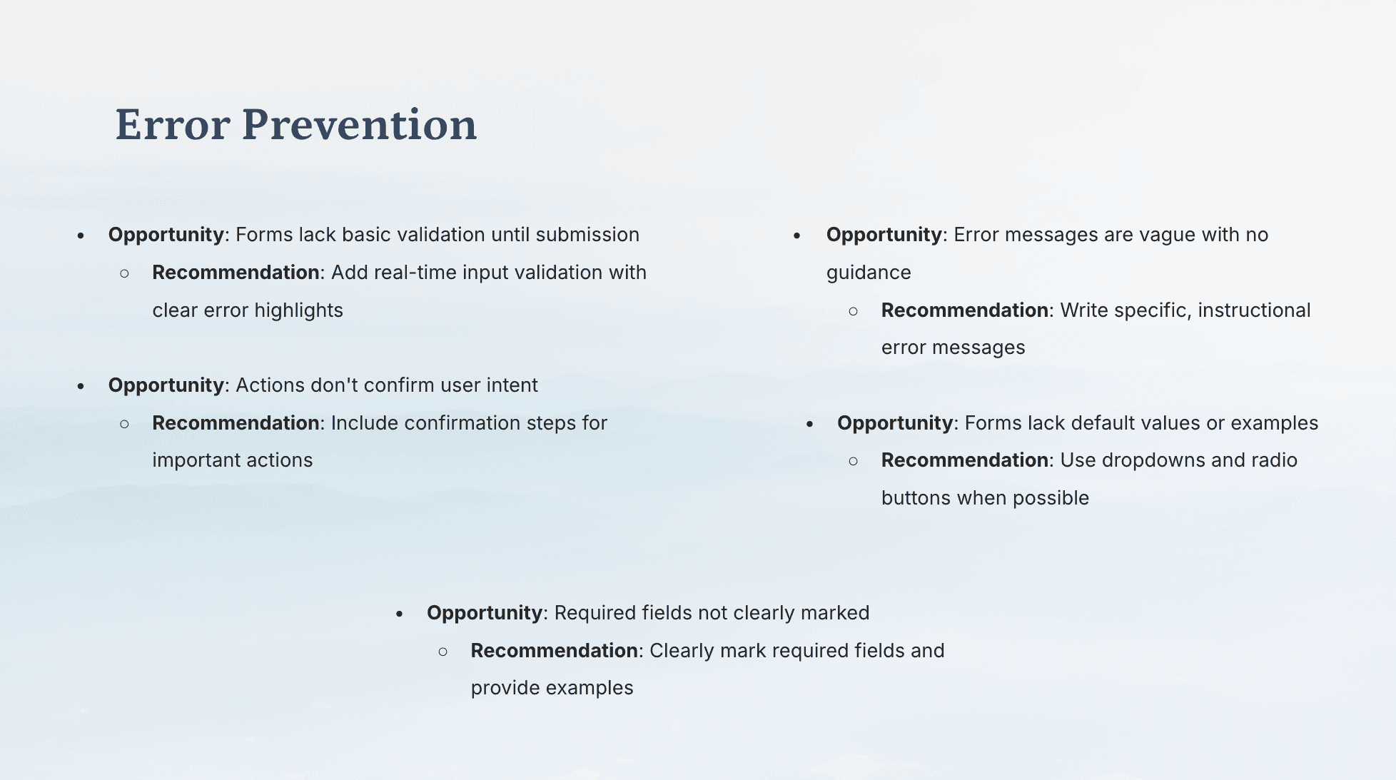
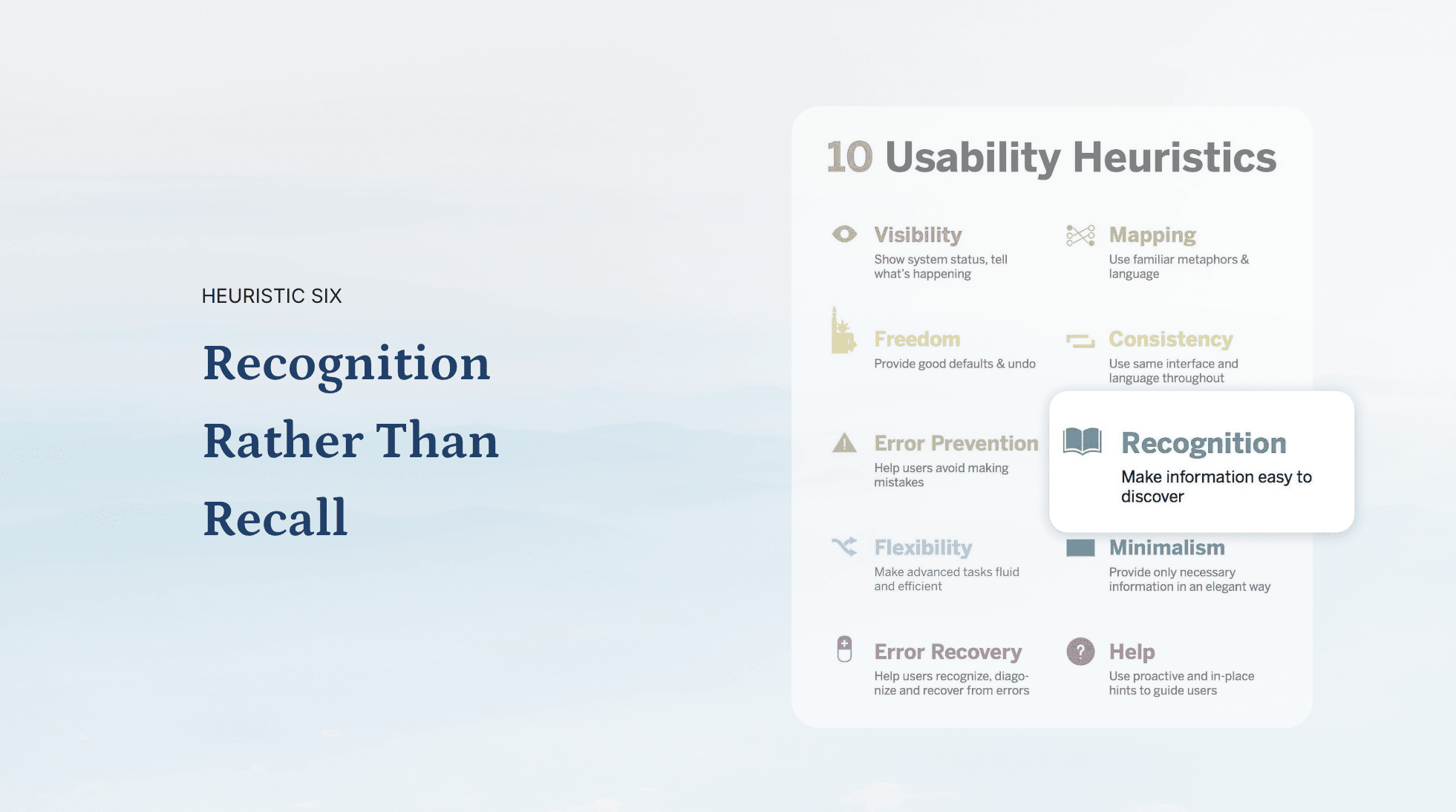
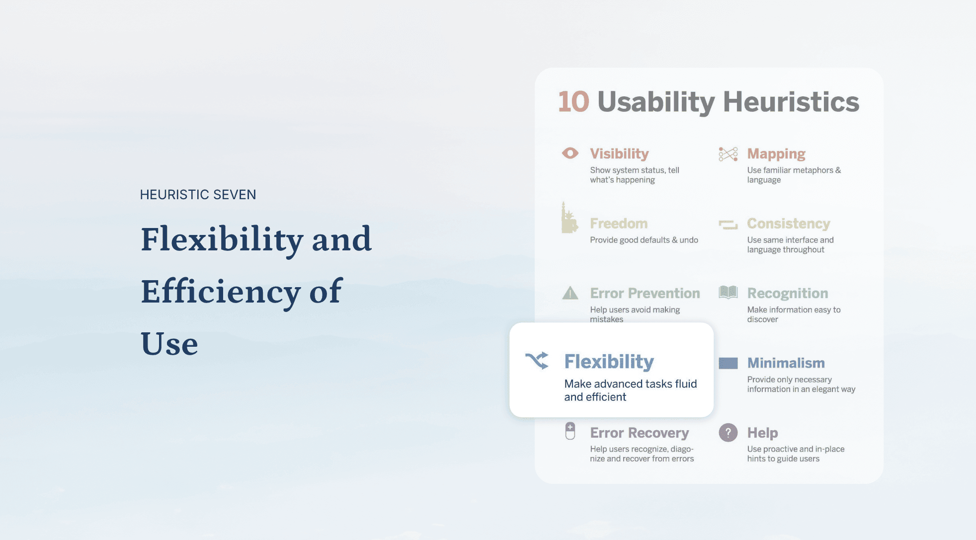
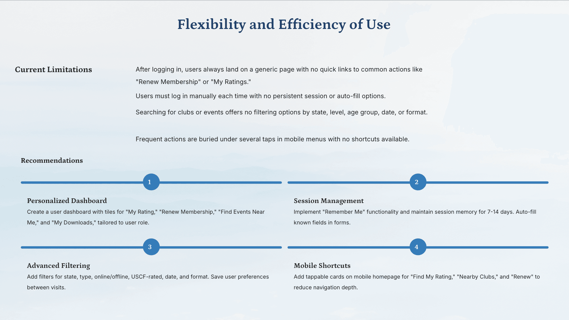
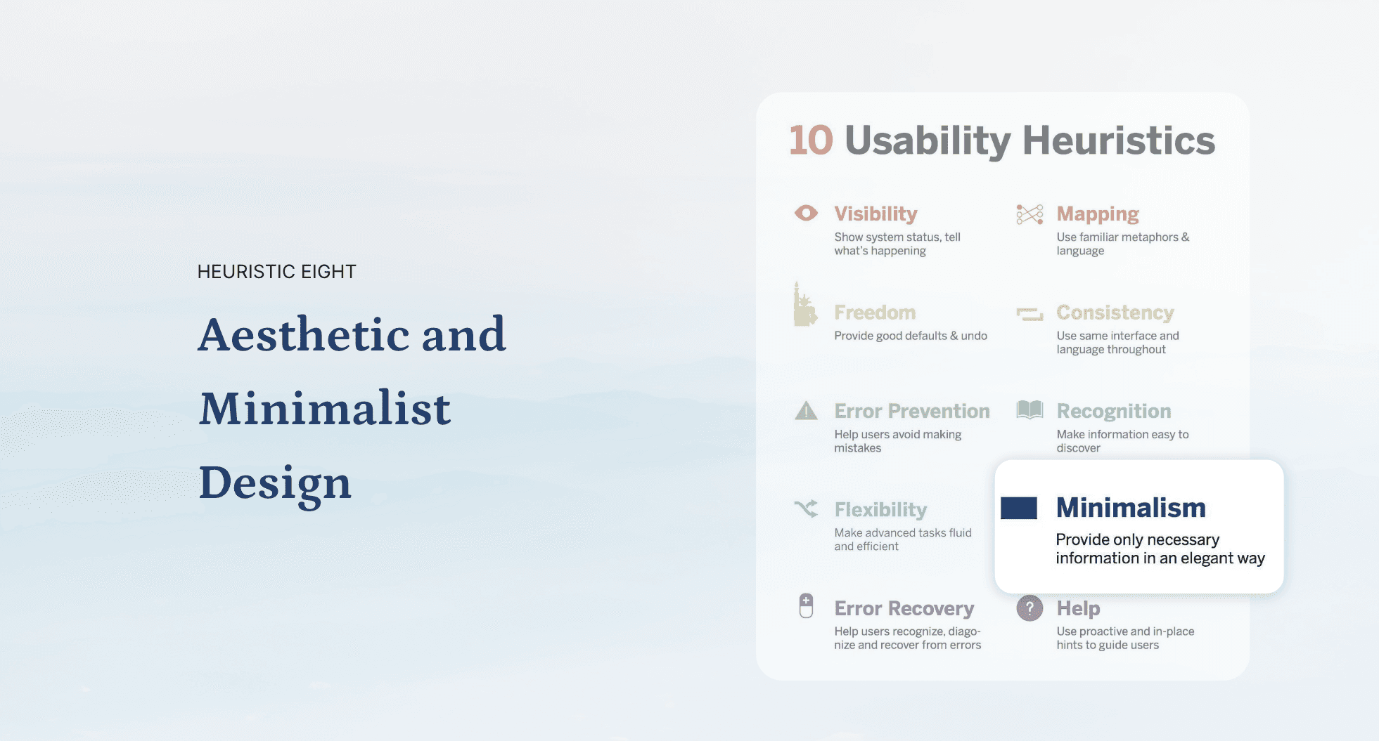
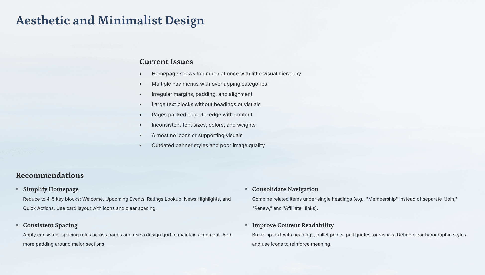
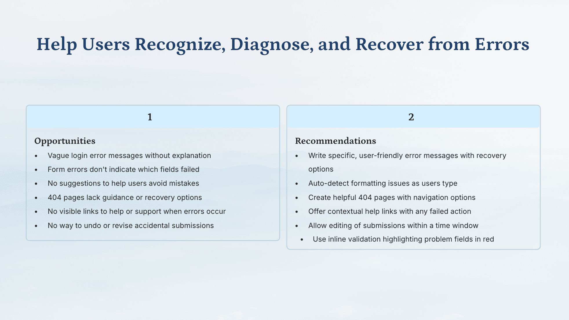
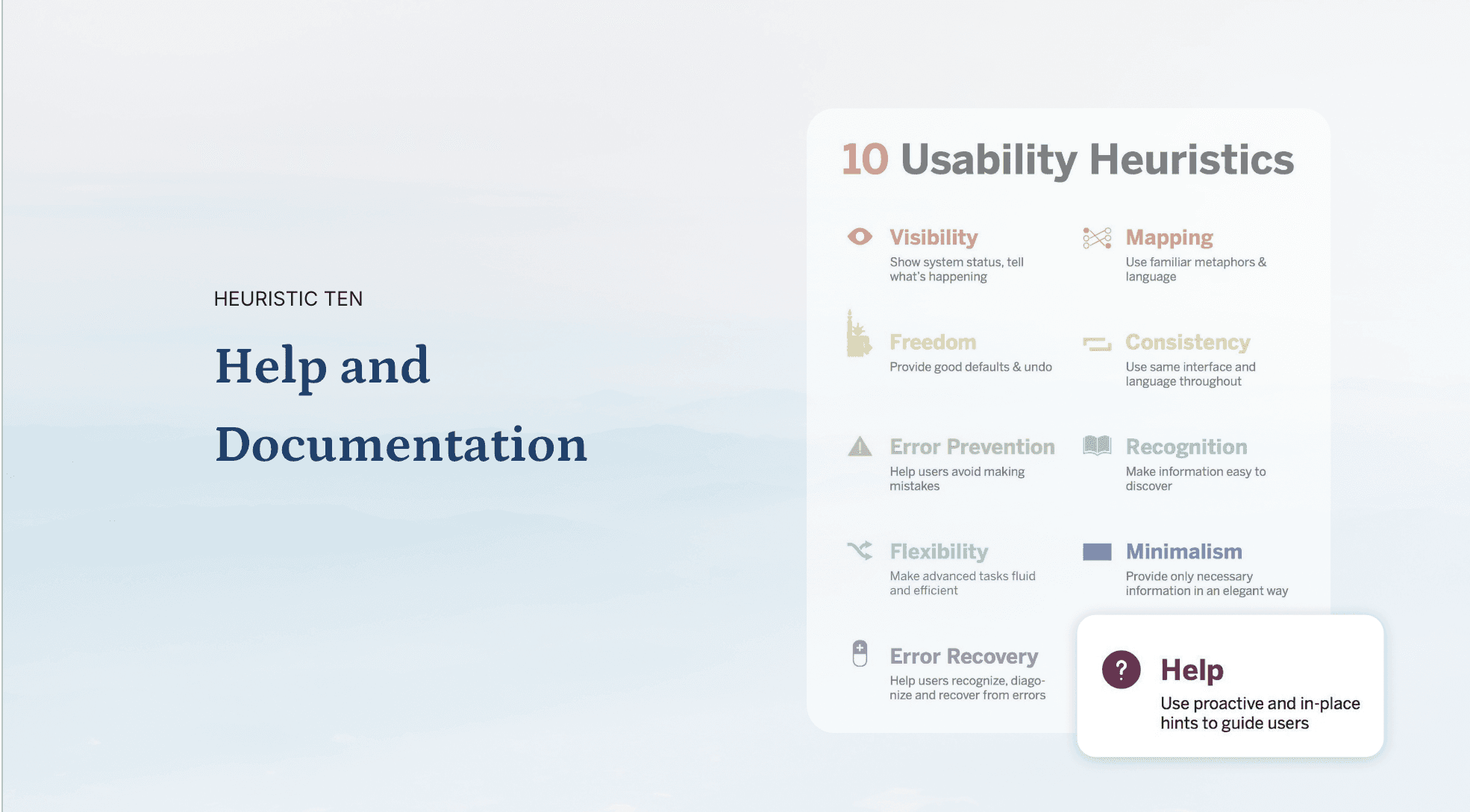
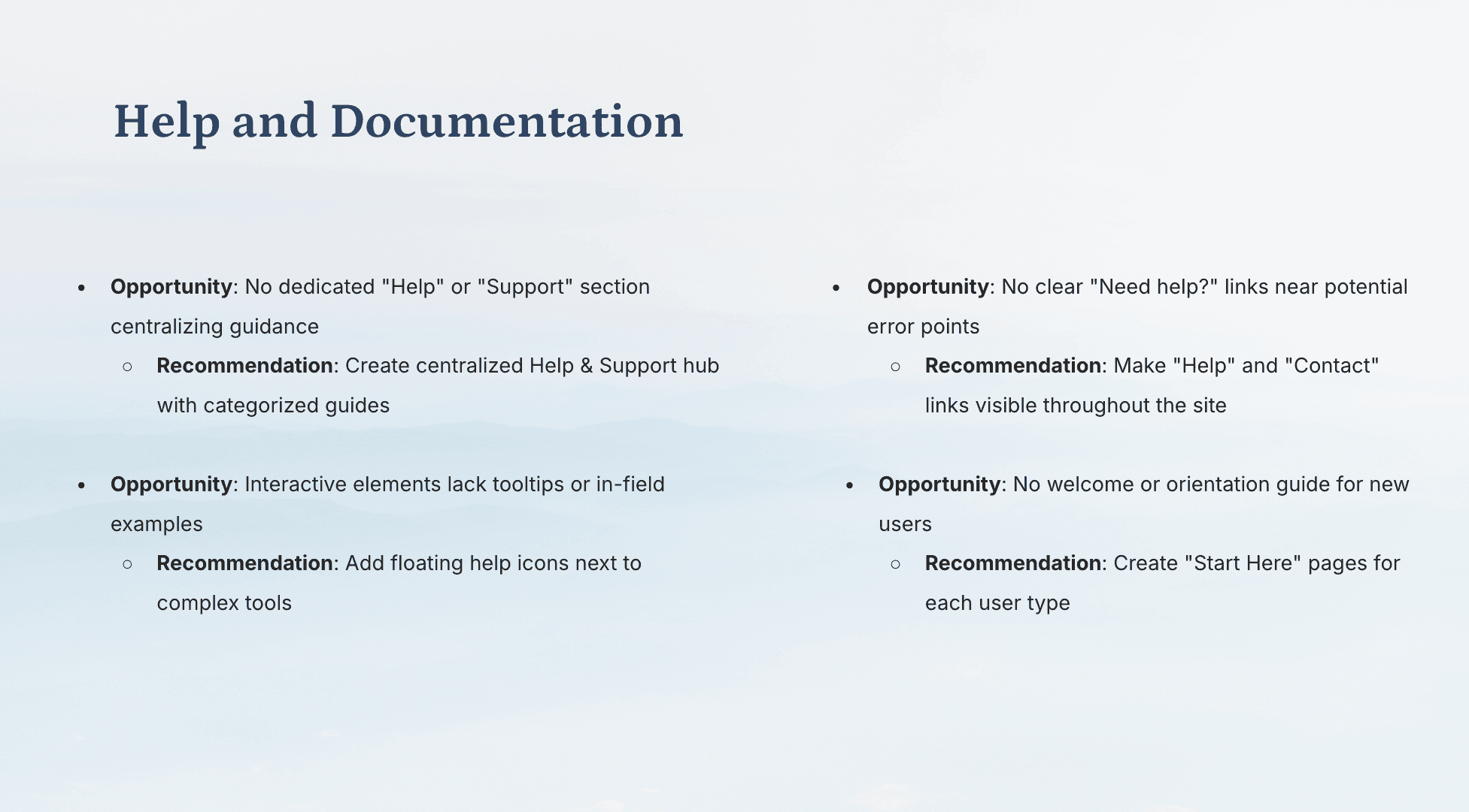
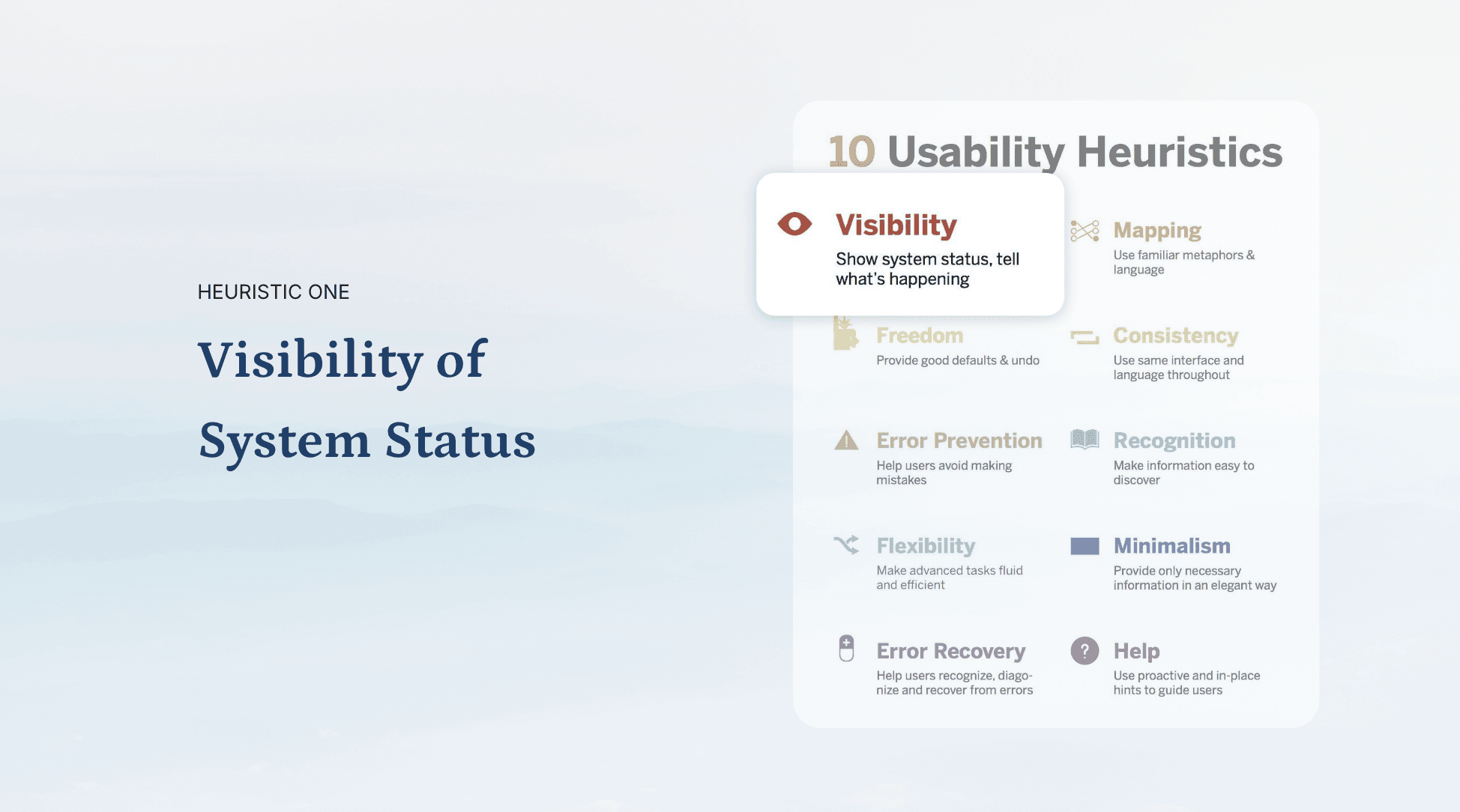
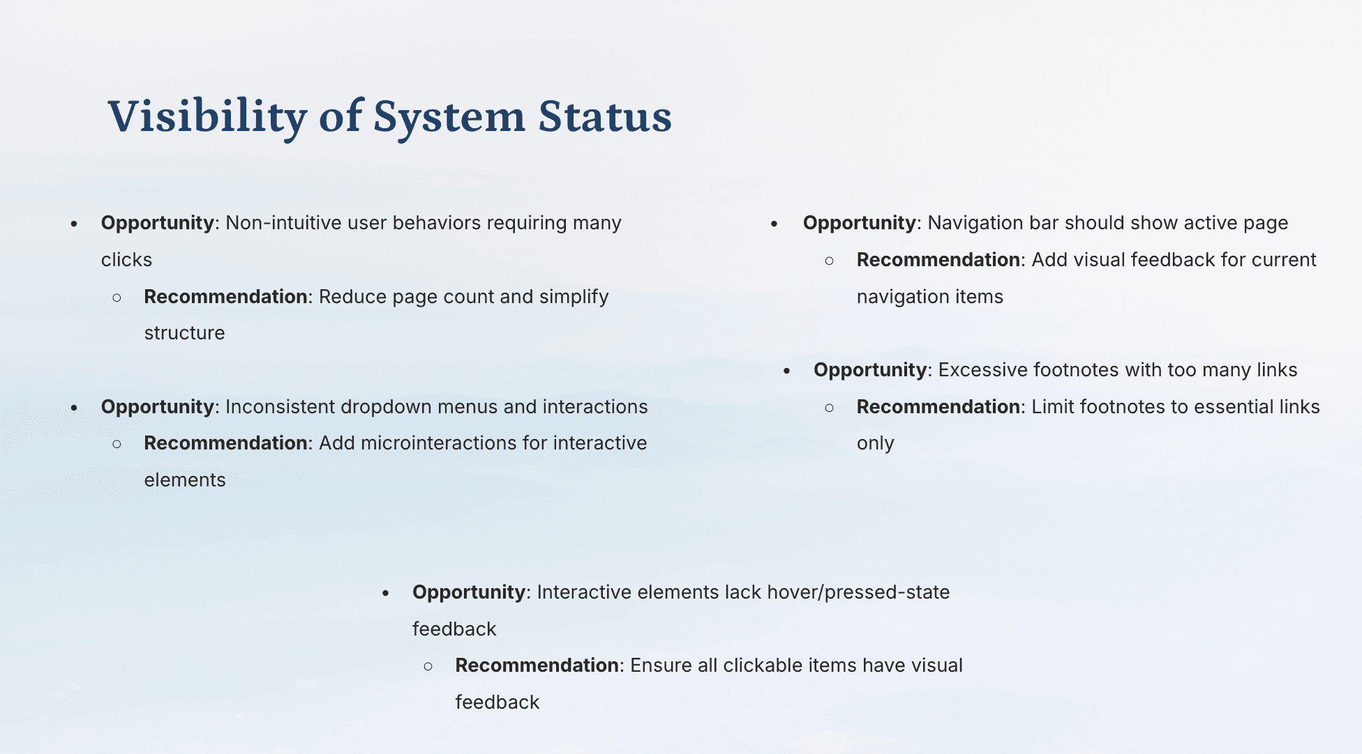
I conducted a Heuristic Evaluation of the USCF website using Nielsen Norman’s 10 usability heuristics as a framework. I systematically analyzed the site against principles such as visibility, consistency, error prevention, and flexibility to identify usability issues. From this evaluation, I developed a set of opportunities and actionable recommendations, which I later presented to the USCF team as part of my research findings.

Competitive Analysis

I analyzed leading sports and enterprise platforms, including the USTA and the International Chess Federation, to identify architectural patterns that could streamline the USCF's complex information architecture.

Key Insights:

  • Navigation Models: Many other organizations structure their headers (mega nav, multi nav, dual nav).

  • Clarity and Consistency: Competitors maintain consistent headers, fonts, and colors. Reinforced the importance of a design system for professional credibility

  • Use of Micro sites: Many organizations use micro sites for specialized user flows

  • Utility Navigation: Other organizations have a clearer and intuitive utility navigation.

User Surveys

I analyzed quantitative survey data provided by the US Chess team to define the primary demographics and task-driven goals of the platform.

  • Core Audience: The website primarily serves tournament players, parents, coaches, and tournament directors.

  • Mismatched Priorities: Users arrive specifically to check ratings, manage memberships, and locate tournaments, but the current interface buries these critical actions.

  • Architectural Needs: Respondents highly requested an improved global menu structure, a dedicated search feature, and quick links for frequent tasks to reduce navigation time.

Site Mapping
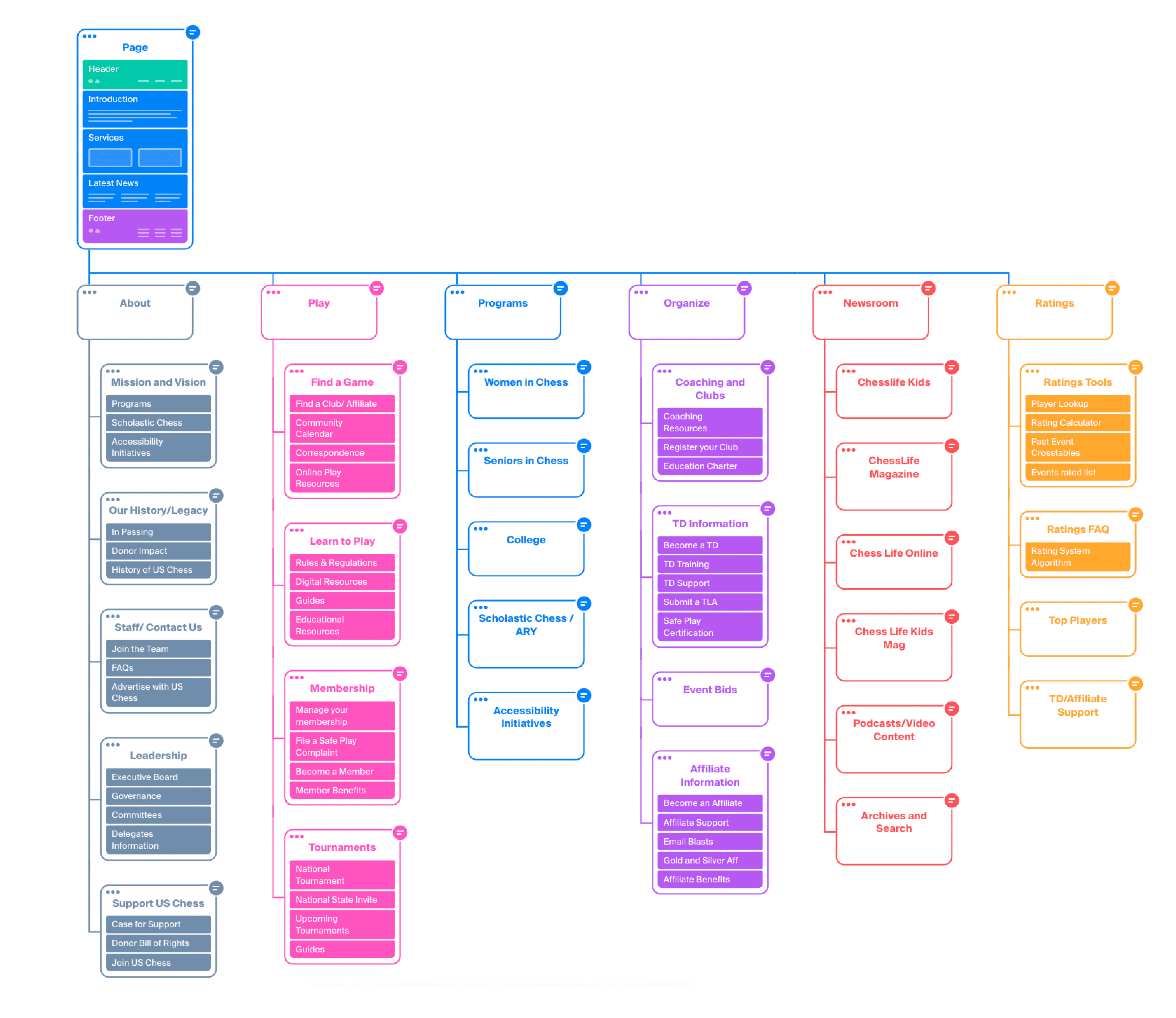
Collaborating closely with the USCF team, I developed a new sitemap that directly synthesized our research findings. The updated architecture eliminates redundant pages, significantly reduces overall navigation complexity, and establishes a highly user-centric hierarchy that aligns perfectly with how players and directors actually use the platform.

Define

Guiding Questions

    •   How might I restructure the navigation architecture to help users find critical information without feeling overwhelmed?

    •   How might I redesign the landing page to simultaneously serve the distinct needs of players, parents, and tournament directors?

    •    How might I establish a cohesive visual language that brings consistency to a previously fragmented and outdated interface?

    •    How might I balance the organization's need to broadcast news with the users' need to quickly access functional tools?

Persona Development

To synthesize the quantitative survey data and ensure the new information architecture remained strictly user-centric, I developed two primary personas. These profiles serve as a cumulative representation of the USCF community’s core motivations, goals, and behavioral patterns.

User Flows

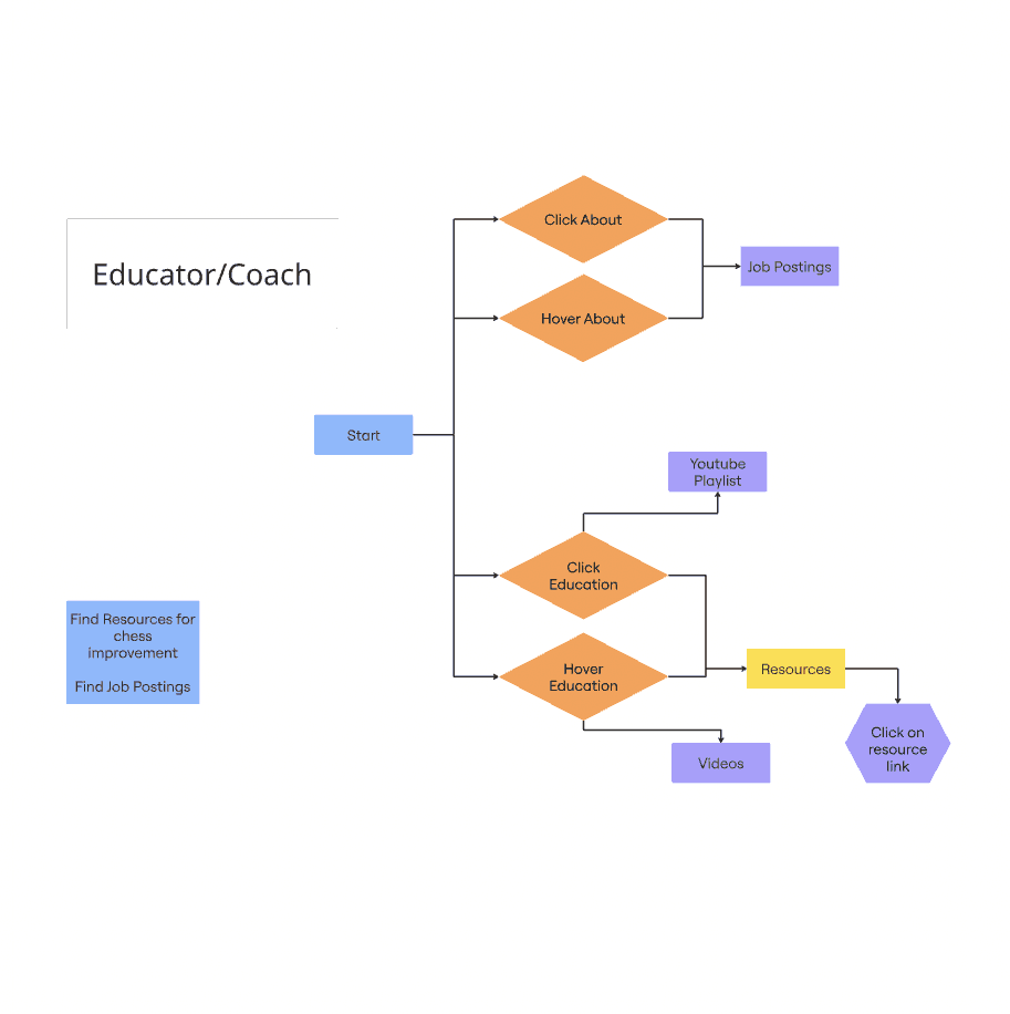
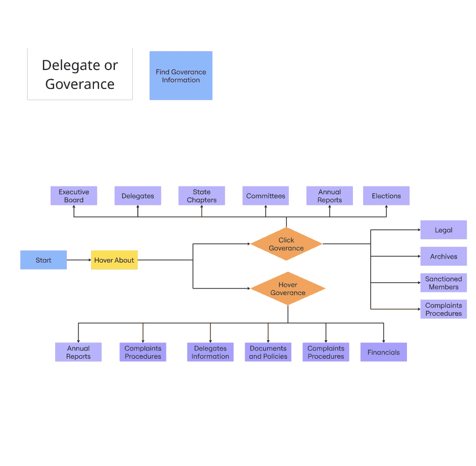
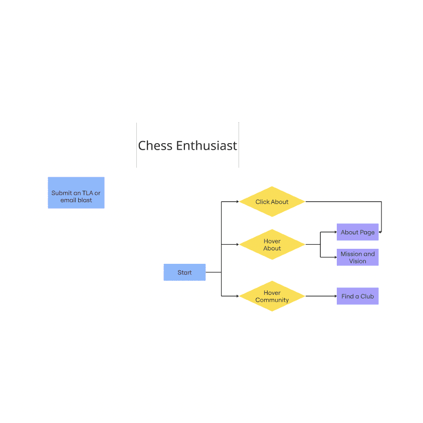
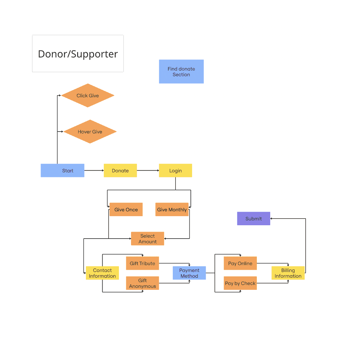
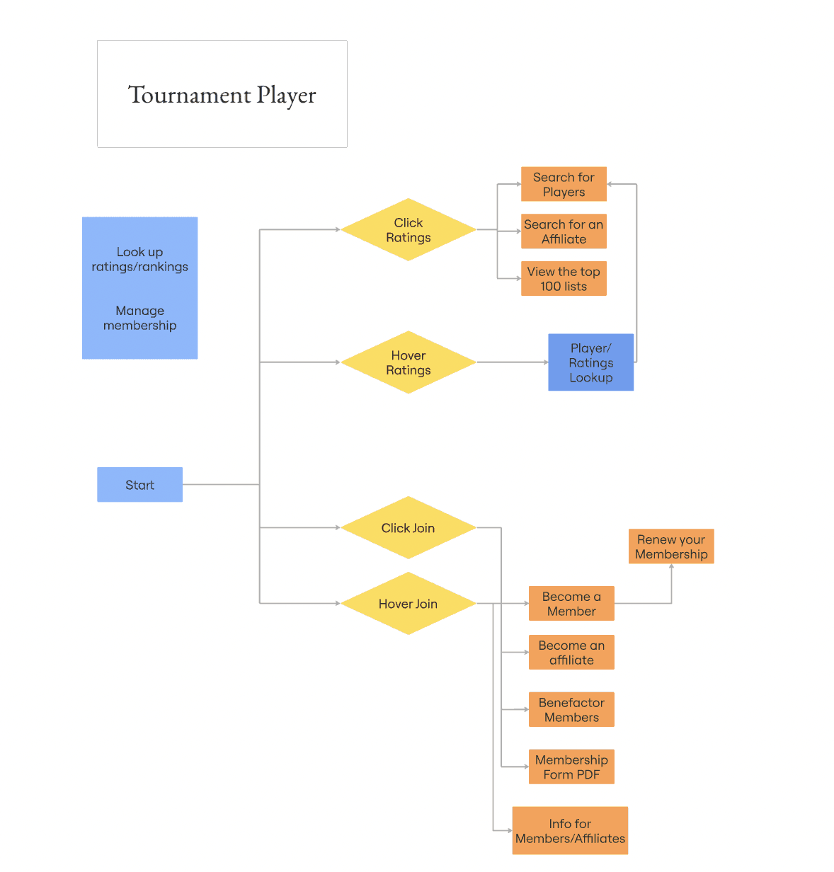
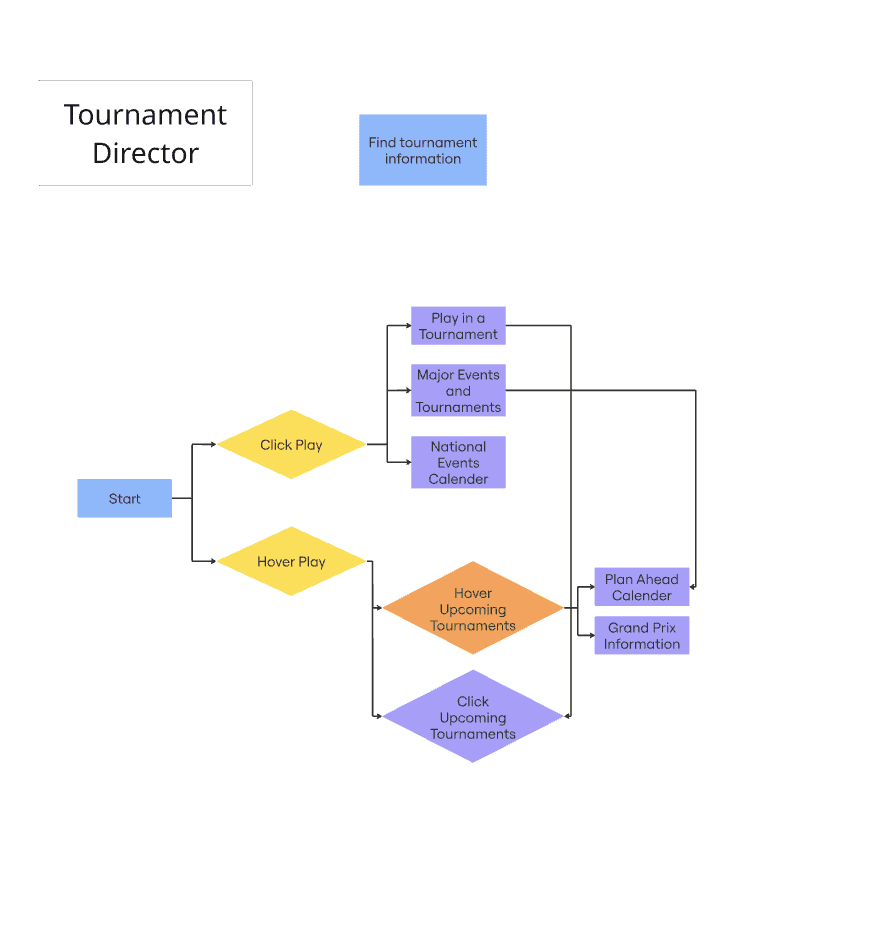
Building upon the established personas, I developed task-driven user flows for the platform's distinct audience segments, including Tournament Players, Directors, and Educators. Mapping these start-to-finish journeys allowed me to visualize the exact steps users currently take to accomplish high-priority goals, such as looking up player ratings, registering for events, or managing memberships. This exercise was critical for identifying unnecessary clicks in the legacy architecture and ensuring the new global navigation intuitively supports these primary paths.
Design Process

Navigation Models

The site’s poor navigation menu was a major factor contributing to its lack of usability. To address this, I created several menu models to present to my team, which allowed us to explore options and identify the most effective navigation structure for the website.

The site’s poor navigation menu was a major factor contributing to its lack of usability. To address this, I created several menu models to present to my team, which allowed us to explore options and identify the most effective navigation structure for the website.

Design System

To resolve existing visual inconsistencies and unify the USCF platform, I established a scalable design system featuring a modernized typography hierarchy for optimal readability across dense informational pages.

Final Design

The final design transforms the digital experience of the US Chess Federation from a fragmented, text-heavy interface into a cohesive and modern platform. By entirely restructuring the information architecture around core user tasks, the redesign drastically reduces cognitive load and empowers players, parents, and tournament directors to navigate the expansive site intuitively.

Key features of the redesign include a streamlined dual-navigation system that deliberately separates utility actions, such as managing memberships, checking ratings, and donating, from primary global exploration. The implementation of a structured mega-menu allows users to seamlessly discover deep hierarchical content without unnecessary clicks, while the modernized landing page utilizes a clear visual hierarchy and quick-access cards to highlight high-priority programs and events.

The site’s poor navigation menu was a major factor contributing to its lack of usability. To address this, I created several menu models to present to my team, which allowed us to explore options and identify the most effective navigation structure for the website.

Design System

To resolve existing visual inconsistencies and unify the USCF platform, I established a scalable design system featuring a modernized typography hierarchy for optimal readability across dense informational pages.

Final Design

Navigation Models

The final design transforms the digital experience of the US Chess Federation from a fragmented, text-heavy interface into a cohesive and modern platform. By entirely restructuring the information architecture around core user tasks, the redesign drastically reduces cognitive load and empowers players, parents, and tournament directors to navigate the expansive site intuitively.

Key features of the redesign include a streamlined dual-navigation system that deliberately separates utility actions, such as managing memberships, checking ratings, and donating, from primary global exploration. The implementation of a structured mega-menu allows users to seamlessly discover deep hierarchical content without unnecessary clicks, while the modernized landing page utilizes a clear visual hierarchy and quick-access cards to highlight high-priority programs and events.

Lessons

Final Thoughts

This project challenged me to think beyond surface-level aesthetics and focus on solving foundational structural issues within a legacy platform. I learned how to balance the dense informational requirements of a national governing body with the practical usability needs of players, parents, and tournament directors to create a solution that is both accessible and highly functional.

One of the most valuable experiences was collaborating directly with the USCF team to decipher years of unstructured content. Analyzing quantitative survey data and conducting heuristic evaluations taught me how to ask the right questions, synthesize diverse user pain points, and translate raw research directly into a concrete, data-driven sitemap and navigation strategy. I also had the opportunity to present my structural recommendations to stakeholders to ensure alignment before moving into high-fidelity design.

Most importantly, this redesign showed me how strategic information architecture creates a tangible impact for a community. Rather than just applying a fresh coat of paint, I learned how intentional UX can untangle complex hierarchies, reduce cognitive load, and empower users to access critical resources without friction.


This project challenged me to think beyond surface-level aesthetics and focus on solving foundational structural issues within a legacy platform. I learned how to balance the dense informational requirements of a national governing body with the practical usability needs of players, parents, and tournament directors to create a solution that is both accessible and highly functional.

One of the most valuable experiences was collaborating directly with the USCF team to decipher years of unstructured content. Analyzing quantitative survey data and conducting heuristic evaluations taught me how to ask the right questions, synthesize diverse user pain points, and translate raw research directly into a concrete, data-driven sitemap and navigation strategy. I also had the opportunity to present my structural recommendations to stakeholders to ensure alignment before moving into high-fidelity design.

Most importantly, this redesign showed me how strategic information architecture creates a tangible impact for a community. Rather than just applying a fresh coat of paint, I learned how intentional UX can untangle complex hierarchies, reduce cognitive load, and empower users to access critical resources without friction.

Explore more

Esha Macha

I design thoughtful digital products that turn complex problems into simple, intuitive experiences through data, business thinking, and AI.

Contact

esha7106@gmail.com

Esha Macha

I design thoughtful digital products that turn complex problems into simple, intuitive experiences through data, business thinking, and AI.

Contact

esha7106@gmail.com

Esha Macha

I design thoughtful digital products that turn complex problems into simple, intuitive experiences through data, business thinking, and AI.

Contact

esha7106@gmail.com